210906 월
7) 테두리 스타일
<!doctype html>
<html lang="ko">
 <head>
  <meta charset="UTF-8">
  <title>07_테두리 스타일</title>
  <style>
	div {
		width:100px;
		height:100px;
		border-width:3px;
	}

	.border-test1 {
		border-style:none;
	}

	.border-test2 {
		border-style:hidden;
		/* 수평거리 수직거리 흐림정도 번짐정도 */
		box-shadow:5px 5px 3px 2px gray;
	}

	.border-test3 {
		border-style:dotted;
	}

	.border-test4 {
		border-style:dashed;
		border-top-color:blue;
	}

	.border-test5 {
		border-style:double;
		border-color:blue;
	}

	.border-test6 {
		border-style:groove;
		border-top-left-radius:50px;
	}

	.border-test7 {
		border-style:inset;
		border-bottom-right-radius:50px;
	}

	.border-test8 {
		border-style:outset;
		border-top-left-radius:50px;
		border-bottom-right-radius:50px;
	}

	.border-test9 {
		border-style:ridge;
		box-shadow:5px 5px 3px 2px gray;
	}

	.border-test10 {
		border-style:solid;
		border-bottom-width : 10px;
	}

	.border-test11 {
		border-top : 5px double blue;
		border-left : 1px dotted black;
		border-right : 1px dashed blue;
		border-bottom : 5px solid black;
	}

  </style>
<body>
<h1>테두리 스타일</h1>
<h3>border-style:none</h3>
<div class="border-test1"></div>
<h3>border-style:hidden & box-shadow:5px 5px 3px 2px gray</h3>
<div class="border-test2"></div>
<h3>border-style:dotted</h3>
<div class="border-test3"></div>
	<h3>border-style:dashed & border-top-color:blue</h3>
    <div class="border-test4"></div>
	<h3>border-style:double & border-color:blue</h3>
    <div class="border-test5"></div>
	<h3>border-style:groove & border-top-left-radius:50px</h3>
    <div class="border-test6"></div>
<h3>border-style:inset & border-bottom-right-radius:50px</h3>
    <div class="border-test7"></div>
	<h3>border-style:outset & border-bottom-right-radius:50px</h3>
    <div class="border-test8"></div>
	<h3>border-style:ridge & box-shadow:5px 5px 3px 2px gray</h3>
    <div class="border-test9"></div>
	<h3>border-style:solid & border-bottom-width : 10px</h3>
	<div class="border-test10"></div>
	<h3>border : 두께 스타일 색상값</h3>
	<div class="border-test11"></div>

 </body>
</html>
08) 레이아웃 스타일(인라인 블럭)
<!DOCTYPE html>
<html lang="en">
<head>
    <meta charset="UTF-8">
    <meta http-equiv="X-UA-Compatible" content="IE=edge">
    <meta name="viewport" content="width=device-width, initial-scale=1.0">
    <title>08_레이아웃 스타일(인라인 블럭)</title>
    <style>
        .size-test{
            border  :2px solid red;
        }
        #test1 {
            width : 800px;
            height : 200px;
        }
        #test2{
            width : 50%;
            height : 200px;
        }

        .block {
            width : 150px;
            height : 150px;
            border : 1px solid black;
            color : white;
        }

        .area1 { background : red; }
        .area2 { background : orange; }
        .area3 { background : yellowgreen; }
        .area4 { background : green; }
        .area5 { background : blue; }

        .block-test1{
            display: inline;
        }

        .block-test2{
            display: block;
        }

        .block-test3{
            display : inline-block;
        }
    </style>
</head>
<body>
<h1>레이아웃 스타일</h1>
<h3>width와 height</h3>
<p>내용이 차지하고 있는 영역의 크기를 조절할 수 있는 속성</p>
<h4>고정 크기</h4>
<div id = "test1" class = "size-test"></div>
<h4>가변 크기</h4>
<div id = "test2" class = "size-test"></div>
<hr>
 <h3>화면 배치 방법 변경</h3>
    <p>블럭 요소와 인라인 요소의 속성을 변경하여
        배치 방식을 변경할 수 있다.
    </p>

    <p>
        블럭 요소 : 한 줄 전체 차지하는 요소. 한 줄에 여러 요소가 올 수 없는 요소.
    </p>

    <pre>Ex. div, p, hn, ul, ol, form, hr, table, fieldset, ...</pre>
    <p>
        인라인 요소 : 한 줄에서 일부분만 차지하는 요소. 한 줄에 여러 요소가 올 수 있는 요소.
    </p>
    <pre>Ex. span, img, input, textarea, lable, button, br</pre>

    <h3>두 요소의 특징</h3>
    <ul>
        <li>블럭 요소는 줄 바꿈 발생, 인라인 요소는 발생하지 않음</li>
        <li>블럭 요소는 width와 height 속성 적용, 인라인 요소는 적용되지 않음</li>
        <li>블럭 요소는 margin-top, margin-bottom, padding-top, padding-bottom 속성 적용,
            인라인 요소는 적용되지 않음
        </li>
    </ul>

    <hr>
 <h4>블럭 요소를 인라인 요소로 변경</h4>
    <pre><b>>> disbplay : inline 테스트</b></pre>
    <pre>인라인 요소로 변경되면서 width와 height 속성이 무시된다</pre>
    <div class = "block block-test1 area1">첫 번째 영역</div>
    <div class = "block block-test1 area2">두 번째 영역</div>
    <div class = "block block-test1 area3">세 번째 영역</div>
    <div class = "block block-test1 area4">네 번째 영역</div>
    <div class = "block block-test1 area5">다섯 번째 영역</div>

 <h4>인라인 요소를 블럭 요소로 변경</h4>
    <pre><b>>> display : block 테스트</b></pre>
    <pre>인라인 요소를 블럭 요소로 변경하면 width와 height 값을 지정할 수 있다</pre>
    <span class = "block block-test2 area1">첫 번째 영역</span>
    <span class = "block block-test2 area2">두 번째 영역</span>
    <span class = "block block-test2 area3">세 번째 영역</span>
    <span class = "block block-test2 area4">네 번째 영역</span>
    <span class = "block block-test2 area5">다섯 번째 영역</span>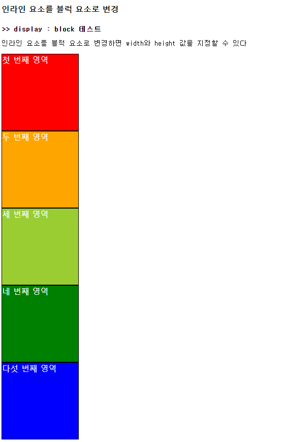
 <pre><b>>> display : inline-block 테스트</b></pre>
    <pre>영역은 인라인 요소로 변경되지만 내용은 블럭 요소로 지정되어 width와 height 속성을 설정할 수 있다
    </pre>
    <div class = "block block-test3 area1">첫 번째 영역</div>
    <div class = "block block-test3 area2">두 번째 영역</div>
    <div class = "block block-test3 area3">세 번째 영역</div>
    <div class = "block block-test3 area4">네 번째 영역</div>
    <div class = "block block-test3 area5">다섯 번째 영역</div>

</body>
</html>
09) 레이아웃 스타일(여백)
<!DOCTYPE html>
<html lang="en">
<head>
    <meta charset="UTF-8">
    <meta http-equiv="X-UA-Compatible" content="IE=edge">
    <meta name="viewport" content="width=device-width, initial-scale=1.0">
    <title>09_레이아웃 스타일(여백)</title>
    <style>
        .test{
            background : yellowgreen;
            width  : 100px;
            height : 100px;
        }

        .test1{
            padding : 100px;
        }

        .test2{
            padding-top : 50px;
            padding-left : 100px;
        }

        .test3{
            margin : 50px;
        }

        .test4{
          margin-top : 50px;
          margin-left : 10px;
        }
    </style>
</head>
<body>
<h1>여백 관련 속성</h1>
<h4>기준 div</h4>
<div class = "test"></div>
<h3>padding</h3>
<h4>테두리와 컨텐츠 영역 사이의 거리를 조절하는 속성</h4>
<p>padding:100px;</p>
<div class = "test test1">콘텐츠 영역</div>
<p>padding-top : 50px; padding-left : 100p</p>
<div class = "test test2">콘텐츠 영역</div>

 <h3>margin</h3>
    <h4>box 레벨이나 inline 레벨의 요소들 간의 간격을 조절하는 속성</h4>
    <p>margin : 50px</p>
    <div class = "test test3">콘텐츠 영역</div>
    <p>margin-top : 50px; margin-left : 10px</p>
    <div class = "test test4">콘텐츠 영역</div>
</body>
</html>
'웹개발 수업 > CSS' 카테고리의 다른 글
| [Day +54 / CSS]CSS 기초(13. 풀스크린 실습, 14. 컬럼 나누기 실습1) (0) | 2021.09.07 |
|---|---|
| [Day +54 / CSS]CSS 기초(10. 레이아웃 스타일(배치) , 11. 레이아웃 스타일(flex), 12. 레이아웃 스타일(grid)) (0) | 2021.09.07 |
| [Day +53 / CSS 과제]텍스트 스타일 실습, 레이아웃 스타일 실습 (0) | 2021.09.06 |
| [Day +53 / CSS]CSS 기초(5. 텍스트 스타일, 6. 배경 스타일) (0) | 2021.09.06 |
| [Day +52 / CSS]CSS 기초(1. 기본 선택자, 2. 다양한 선택자1, 3. 다양한 선택자2, 4. 선택자 우선순위) (0) | 2021.09.06 |


